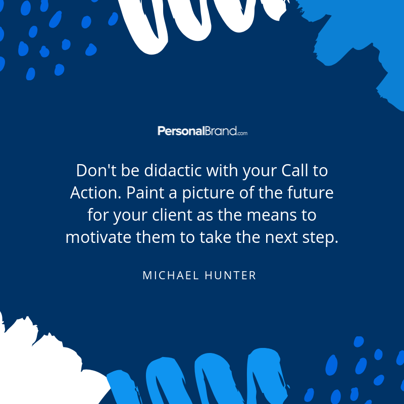
Nine Tips for Creating an Effective Personal Brand Website Call-to-Action
What do weddings and website conversions have in common?
Most of them happen because one party asks another to act.
Asking a prospect to download a piece of content or sign up for a newsletter is like asking someone to marry you.
You both may be feeling a connection with one another and may be seeing the value of a long-term alignment, but nothing comes from nothing, and someone must pop the question.
Your personal brand website can be full of valuable brand information, insights, and service information, but if you want to convert a prospect and turn them into a customer, you need to ask them to act. Enter the marketing call-to-action (CTA).
Just like with marriage proposals, there is a right way and a wrong way to make the request, so to help you create engaging, intriguing, and motivating CTAs that elicit the intended response from your prospect, we’re bringing you nine expert tips for producing effective CTAs for your personal brand website.
What is a CTA?
A CTA is any language you include in a communication piece that encourages a user to take action to further interact with your personal brand. CTAs often appear at the end of a marketing message to guide a prospect into taking the next step if they are interested in an offering.
CTAs may appear as text on a button that triggers a sale conversion, prompts the visitor to supply their contact information for future outreach, or any other such step that moves the prospect through the sales funnel.
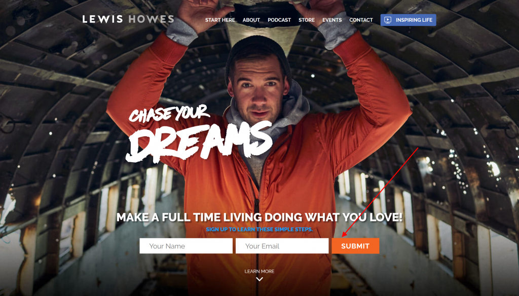
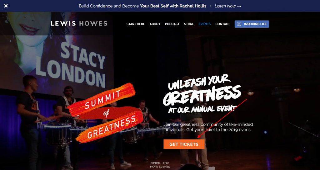
Here are two examples, both from the enigmatic author, lifestyle entrepreneur, high-performance business coach and keynote speaker, Lewis Howes:
Newsletter sign-up CTA
Conversion CTA
For entrepreneurs and solopreneurs who serve as their own marketing departments, the CTA can quickly become an overlooked component of the marketing strategy, especially for a personal brand website.
You may feel like your prospects should clearly know how to get in touch with you (after all, you have a contact page), or you may not want to come across as pushy by splattering your website with “Buy Now” buttons. Your goal should be to find an optimal balance. Every business needs to guide prospects through the buying cycle from the learner, shopper, to buy phases until they convert.
Creating such a pathway without using language that invokes thoughts of pushy infomercial tactics will elevate your brand to a more sophisticated level, and exponentially boost conversions and revenue.
When it comes to motivating a prospect to interact with your brand, any old text, of any size, color, and placement, will not do. There are proven visual and messaging techniques that can impact the effectiveness of your marketing efforts. This article will provide you with proven strategies to create impactful CTAs that motivate prospects into further engagement with your brand to help you achieve your goal: conversions. For best results, when creating CTAs on your personal brand website, leverage these nine best practices.
1. Use a Strong Verb
Motivate your prospects to action by using a commanding and powerful verb as the leading word in your CTA. The following are good examples of powerful leading verbs:
- Shop
- Buy
- Order
- Subscribe
- Discover
- Join
- Book
- Learn
- Download
- Find
Avoid phrases that don’t indicate clear direction or that are too soft in their requests, such as “We think you’d like…” or “Please take a look…”
2. Make Your CTA Stand Out Visually
Choose a color for your CTA button that produces a high contrast against its background. Simple black text on a white background that is the same weight, font, color, and size as the paragraph text that precedes it will not gain the attention of someone scanning your personal brand website. Instead, create an eye-grabbing object that triggers an interaction, such as a button or box that dramatically stands out from the rest of the content on the page.
If you’re unsure where to begin the process of creating visually dynamic CTAs, consider these case studies:
- Enterprise resource planning software giant SAP found that orange CTAs boosted their conversion rate over 32.5%.
- Marketing automation company Performable boosted their conversions by 21% by making their CTAs red.
- Online student debate forum CreateDebate increased their CTA clicks 45% by turning them into buttons.
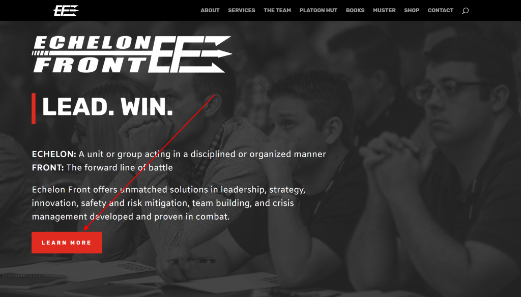
Check out this example of a high-contrast CTA button on the homepage of Echelon Front, a leadership solution company run by entrepreneur, author, and former Navy Seal Jocko Willink.
Bonus Ninja Content: For more tips on personal brand website design, check out this advice from startup strategy consultant and serial web entrepreneur John Conner.
4. Create a Sense of Urgency
Have you ever purchased a product that you didn’t need because it was only on sale for a limited time? We all have. FOMO (“fear of missing out”) does not only plague Millennials and Gen Z.
We all are susceptible to feeling the pressure to act out of a desire not to miss an opportunity. Build excitement into your CTAs by creating a sense of urgency that motivates the prospect.
This approach is highly effective if you are running a limited time offer.
Examples of CTA language with urgent messaging include:
- Buy now
- Save your seat
- Take advantage of our free trial
- Limited time offer
- Act now before supplies run out
- Offer expires on December 31
- Respond before January 1 to enroll at this special price
- Reserve a spot by November 31
5. A/B Test Your Messaging
You may think you know what words and phrases will motivate your prospect to act, but testing language options may surprise you. To inform your CTA decision-making, A/B test your CTAs on your personal brand website. Test more straightforward copy, such as “Subscribe Now” with more aspirational language, such as “Earn a C-Suite Salary” and see which performs better with your audience over time.
What is A/B Testing You Ask?
A/B testing is a digital marketing strategy in which you program your website to randomly display two versions of the same webpage to users to determine which one performs better in key metrics, such as click-through rates and time on page.
To A/B test your CTAs, you will need to use a website content management system (CMS) that allows for such functionality.
You will also need to monitor the page performance over time and then adjust content and messaging based on your findings.
6. Use Words that Speak Directly to the Prospect’s Desired Outcome
As a lifestyle coach, for example, you may, in the short-term, be inviting a prospect to make an appointment for a one-hour coaching session you with, but in the long-term, you’re asking the prospect to take the first step toward achieving the lifestyle he’s always wanted. Instead of using generic CTA phrases like “Book now” or “Download the Fact Sheet,” use words and phrases that reinforce to your prospect what they will accomplish with your help. Examples include:
- Take your first step on the road to recovery
- Earn your first million
- Book your adventure
- Live the life you desire
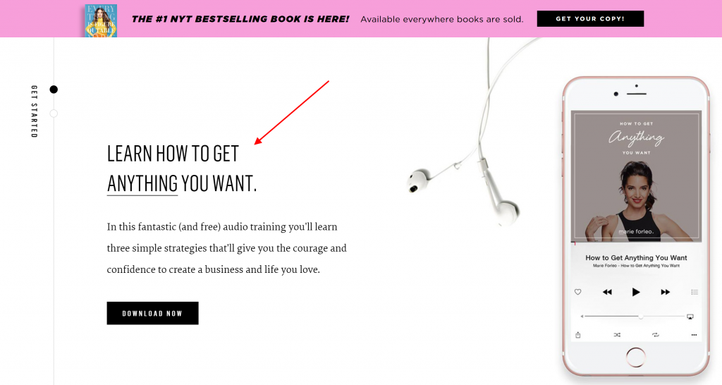
For example, life coach, motivational speaker, author, and web television host, Marie Forleo encourages her personal brand website visitors to “Learn how to get anything you want.”
7. Animate Your CTA
Catch the attention of your personal brand website visitors by using a hello bar, slider, dropdown, or another animated engagement element to showcase your CTA. For example, if you are trying to get website visitors to sign up for your newsletter to help build your email marketing list, you could put your subscription CTA at the bottom of your homepage and hope the visitor scrolls down to see it.
Or you could drop the sign-up CTA right into the center of the homepage a few seconds after they arrive—making your CTA impossible to ignore.
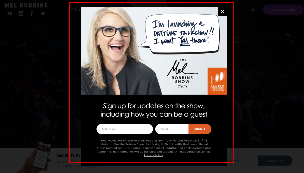
For example, television host, author, and motivational speaker Mel Robbins uses a dropdown box to encourage website visitors to sign up for information about attending the taping of her new television show. In this example, a black, semi-transparent box covers the whole homepage a few seconds after arrival, making it impossible to miss her invitation.
8. Make it Personal
Our brains are wired to note first-person language. When something is personal, and speaks to us directly, in our voice, it is more relatable and intriguing. To benefit from this bit of science, use first-person tense in your CTAs. Instead of, “Download our Fact Sheet,” try, “Start My Free Download.” Instead of “Attend Our Webinar,” try “Save My Seat.” Marketing automation software leader HubSpot reports that personalized CTAs convert 42% more visitors into leads than untargeted CTAs.
9. Reinforce Risk-Free, No-Obligation Commitments
Like it or not, we now live in an era where free 7-day trials are standard. Amazon has radically revolutionized the publishing industry by offering a free preview of the first 10 percent of its eBooks so readers can preview the content before they purchase. As a result of such trends, consumers want to know that they can learn more about a service or solution before they invest heavily financially.
Using language that helps suppress fears surrounding buyer remorse will help to boost clicks and conversions. For example, promises such as, “Make an Appointment for a Commitment-Free Consultation,” or “Sign Up for a Free 7-Day Software Trial” may give prospects the comfort they need to take the next step. And, once they experience the benefits of partnering with you, they’ll be fully prepared to make a purchase.
10. Add a CTA to Every Page of Your Personal Brand Website
Your personal brand website should be designed to help prospects learn about who you are and what you offer and ultimately make a purchase. Any page that leads to a dead-end and does not keep moving your prospect through the education phase to the purchase phase isn’t working hard enough to help you accomplish your sales goals. Even if it’s your biography page, include a CTA. It could be to learn about your service offerings or to attend your upcoming conference. Every page and every message should extend an invitation to your prospect to engage further.
You may be thinking, “Every page of my website includes top-level navigation, and there’s always the back button.”
Asking your prospect to scroll back up to the top of the page, or navigate backward, is asking them to put in too much effort to learn more.
Create a path of least resistance by placing your CTAs at the end of your page content to keep them engaged.
Marketing expert Neil Patel found that website visitors prefer to learn about an offer before clicking a CTA. By placing his CTA above the fold he decreased conversions by 17%.
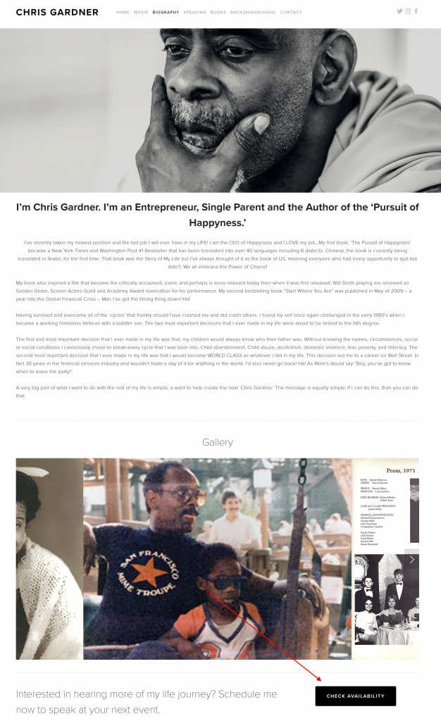
Here is an example from Chris Gardner, author of The Pursuit of Happyness, and motivational speaker. Chris includes a CTA on his biography page to check his availability for guest speaker opportunities.
Final Words of Advice
If you take one critical piece of advice away from this article, we hope it’s this:
Ask. Just ask.
We know you offer exceptional insights and services to your audience, and your prospects will experience your value soon, too, but first, you need to keep them engaged with your personal brand website content. Your website should be your most impactful tool to educate prospects and keep them moving through your sales cycle—and your calls-to-action are the vital impetus of movement that you need to keep that engagement flow happening.
For inspiration and more best practices for creating an impactful personal brand website, check out this article, Six of the World’s Best Personal Brand Websites.
See what we did there? 😉
We hope you enjoyed this article, thanks for reading! Also, follow us on Facebook, and Twitter for updates every time we publish!